February 1, 2013
 New Scientist Magazine was launched in 1956 "for all those men and women who are interested in scientific discovery, and in its industrial, commercial and social consequences".
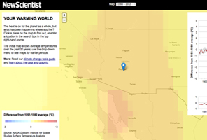
In an interactive graphic display, Your Warming World, New Scientist Magazine presents results from a global analysis of surface temperatures from 1880 to the present called GISTEMP, produced by a team at NASA’s Goddard Institute for Space Studies in New York City.
The graphs and maps all show changes relative to average temperatures for the three decades from 1951 to 1980, the earliest period for which there was sufficiently good coverage for comparison. This gives a consistent view of climate change across the globe. To put these numbers in context, the NASA team estimates that the global average temperature for the 1951-1980 baseline period was about 14 °C.
The analysis uses land-based temperature measurements from some 6000 monitoring stations in the Global Historical Climatology Network, plus records from Antarctic stations recorded by the Scientific Committee on Antarctic Research. Temperatures at the ocean surface come from a measurements made by ships from 1880 to 1981, plus satellite measurements from 1982 onwards.
Surface temperature measurements are not evenly distributed across the globe. So the NASA team interpolates from the available data to calculate average temperatures for cells in a global grid, with each cell measuring 2 degrees latitude by 2 degrees longitude. The analysis extrapolates up to 1200 kilometres from any one station, which allows for more complete coverage in the Arctic – where monitoring stations are sparsely distributed, but where the warming trend is especially strong.
The NASA team also corrects the data to remove local heating caused by dense human settlements – a phenomenon known as the urban heat island effect. Temperature stations in urban areas are identified by referring to satellite images of the light they give off at night, and their records are adjusted to reflect the average trend of nearby rural stations.
Check out the data in your area at Your Warming World.
Credits
- Interactive built by Chris Amico and Peter Aldhous.
- NASA GISTEMP analysis by James Hansen, Reto Ruedy, Makiko Sato and Ken Lo.
- Thanks to Robert Schmunk for help in obtaining data.